HappFest
A marketplace for party supplies and services. I started the product and built the buyer app in Flutter. This case shows what I built and how I’d redesign it today.
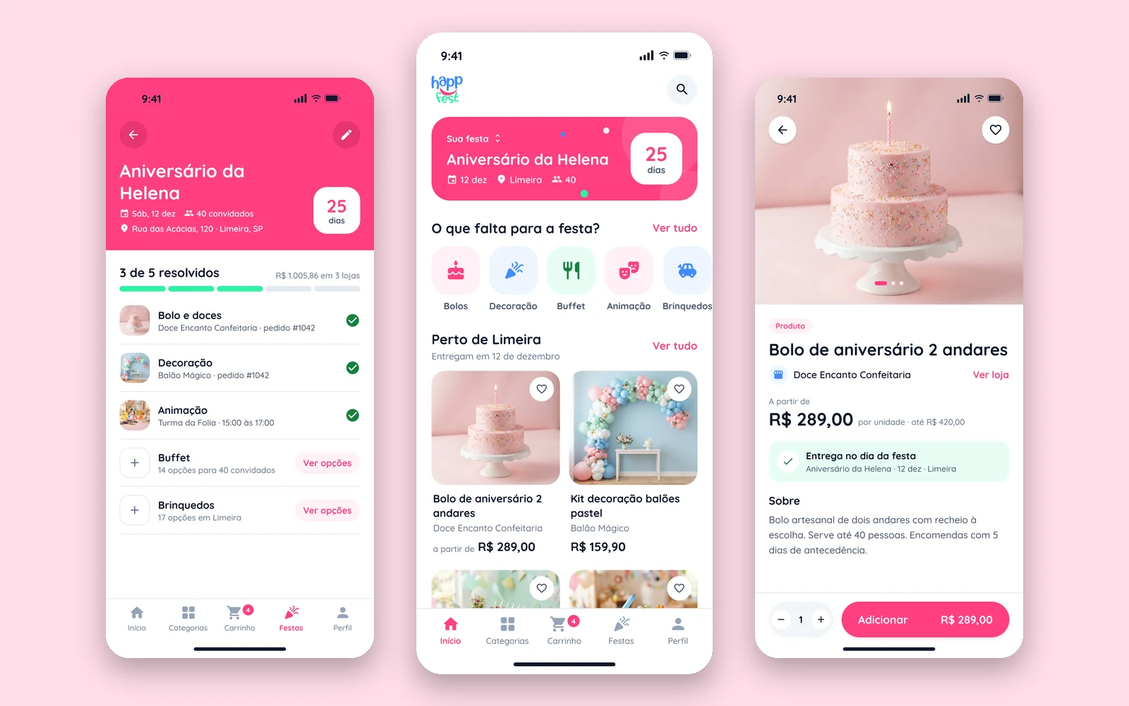
One party, many suppliers
Planning a party means buying from several small businesses at once: the cake, the decoration, the buffet, the entertainment.
HappFest puts those suppliers in one app. A customer registers a party with a date, a place and a number of guests, then buys products and books services for it. One order can involve several stores, and each store delivers to the party.
I started the product. Its direction changed later, I sold my stake, and the app was never published. What follows is the build as it stands in the code, and a redesign I did afterwards.
The buyer app, end to end
- Browsing, search and categories, open to visitors without an account
- Product and service pages, with date and time booking for services
- Cart, a four-step checkout, and payment by Pix, boleto or card
- Parties, addresses, orders and account
- A small design system in code: tokens, components and a storybook screen
I wrote it in Flutter with AI-assisted development. I spent the effort on architecture and behavior, and left the interface on Material defaults with the brand colors applied. It works. It also looks like every other app built that way, and it says nothing about parties.
Four decisions
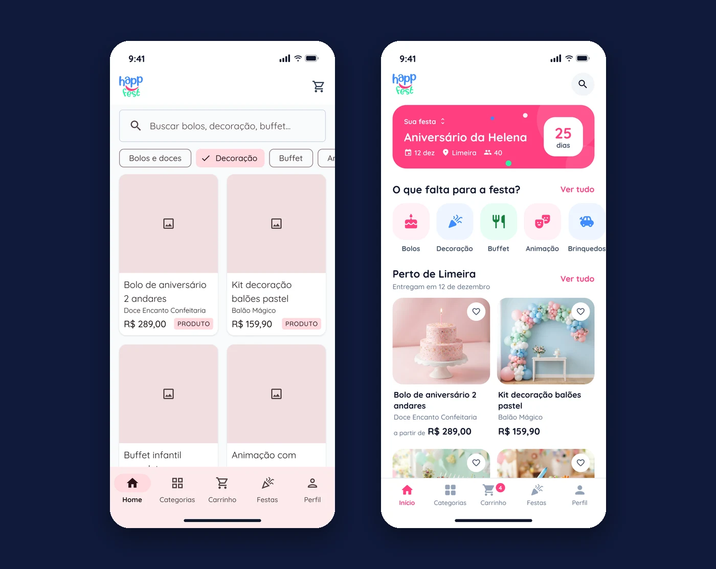
The party is the context, not a checkout step
- Problem
- The app only asks which party you’re buying for at step two of the checkout. But the date, the city and the guest count decide what you can buy at all.
- Change
- The party sits at the top of the home screen with a countdown. Categories become “what’s still missing”, and listings show who delivers to that city on that date.
- Why
- A catalog makes the customer do the filtering. They already told us the three things that matter.
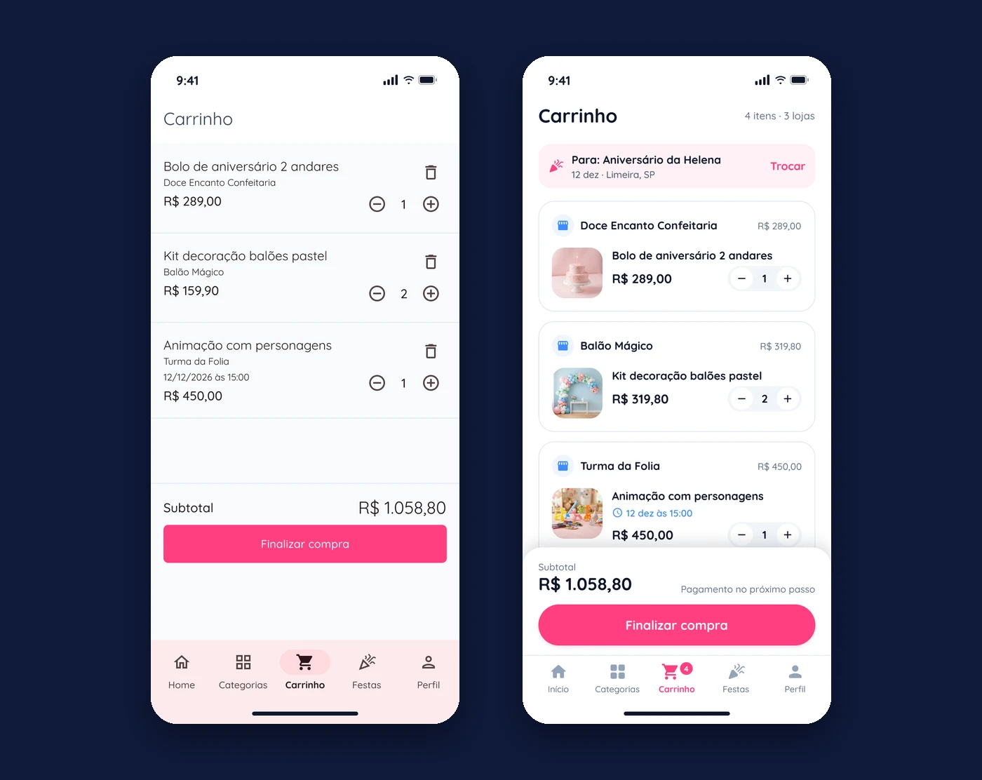
The cart shows the stores
- Problem
- The cart is a flat list. It hides that the order is split across three suppliers, each with its own delivery.
- Change
- Items are grouped by store, each with its subtotal. Booked services show their time. The party the order is for stays visible.
- Why
- In a marketplace, who delivers what is the first question after the price.
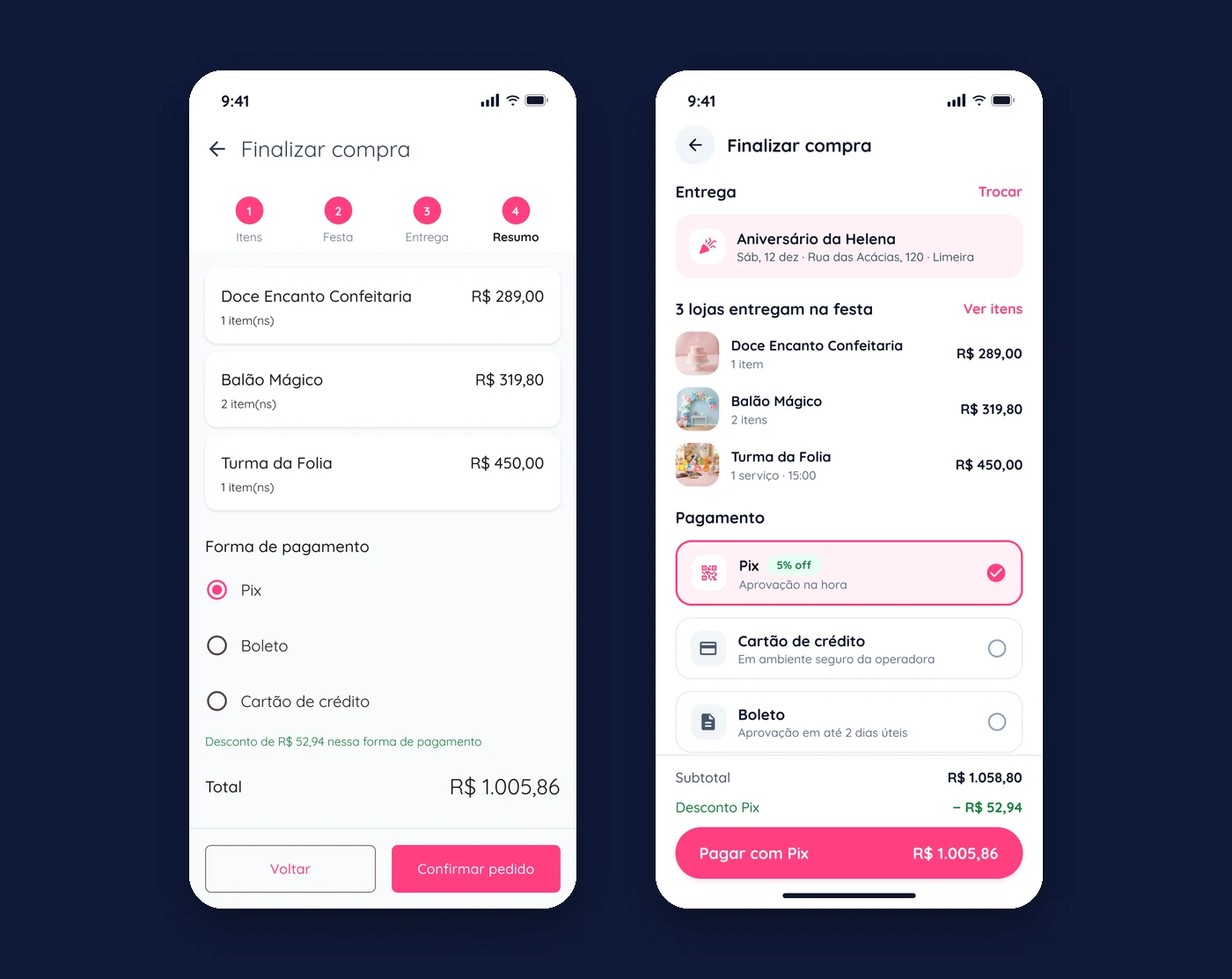
Four checkout steps become one screen
- Problem
- Items, party, delivery, summary. Two of the four steps only confirm what the customer already chose, and the delivery step has nothing to decide.
- Change
- One screen: where it goes, which stores deliver, how to pay. The button carries the payment method and the final amount.
- Why
- Each extra step is a place to drop off. The only real decision left at checkout is the payment.
Ask for less before the first purchase
- Problem
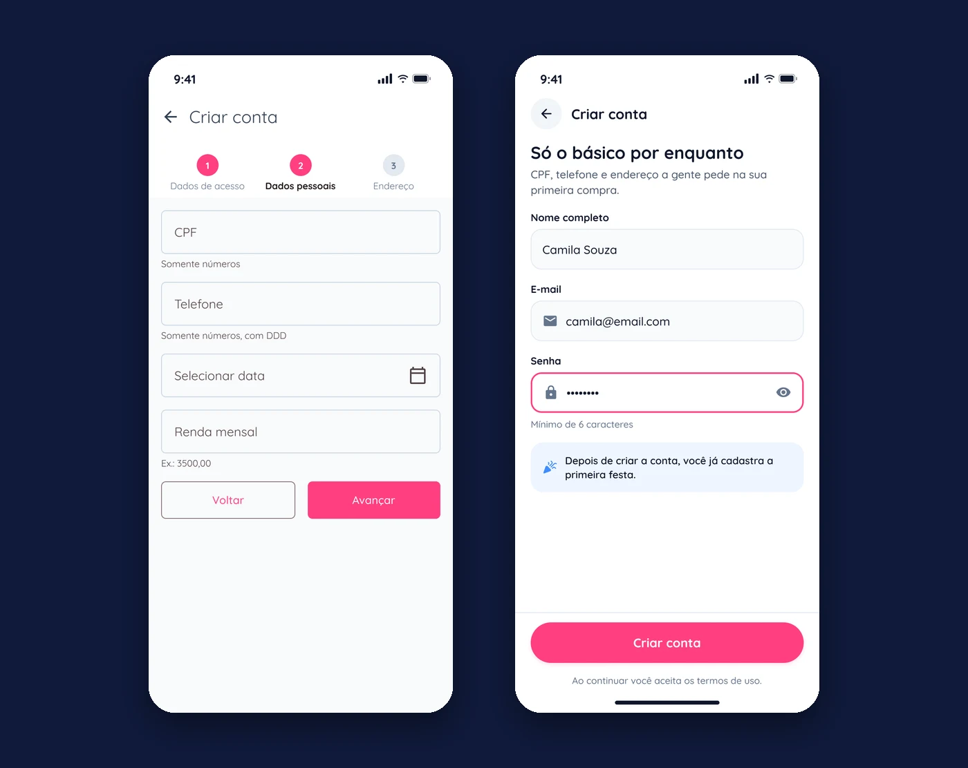
- Creating an account takes three steps and asks for CPF, phone, date of birth and monthly income before the customer has seen anything worth buying.
- Change
- Name, email and password. The rest is requested at the first purchase, when there is a reason for it.
- Why
- People give data when they understand what it’s for.
A screen the build doesn’t have
Orders are already tied to a party in the data. The redesign uses that to give each party its own page: what’s booked, what’s missing and how much has been spent, with each store’s status one tap away.

The brand stays as it was: the same pink, blue and green, the same typeface and logo. What changes is how they’re used. Rounded shapes that echo the logo, color reserved for meaning, and photography doing the selling.
A proposal, not a result
The redesign was never built or tested. The party countdown, filtering by delivery date and the party checklist are proposals. Products, stores and prices on these screens are sample content, and the product photos were generated with AI as placeholders.
If I picked this up again, I’d test the first decision before anything else: does starting from the party change how much people put in the cart?