QuickBooks Reimagine
Redesigning QuickBooks Brazil’s acquisition pages, and proving each change with an A/B test before scaling it.
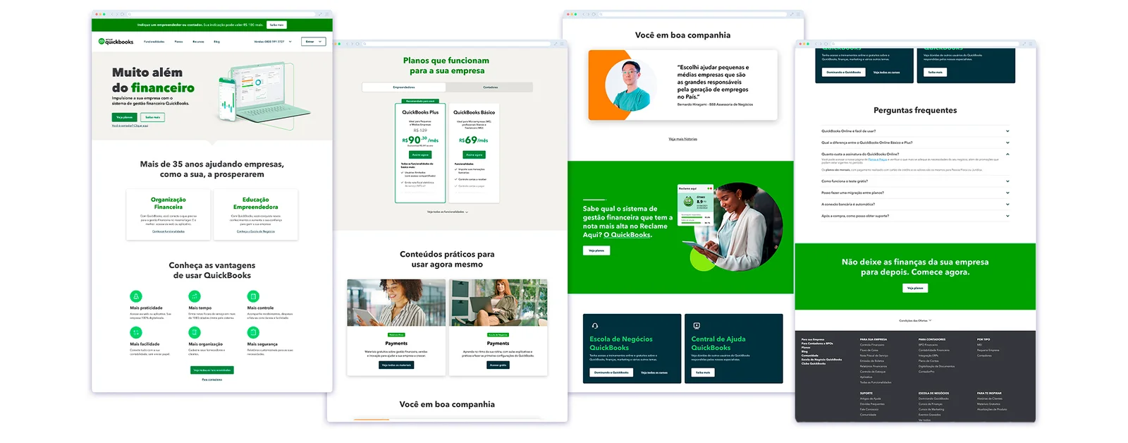
Traffic wasn’t the problem. The story was.
People reached the QuickBooks Brazil site and didn’t find a clear reason to start.
Intuit wanted to grow subscribers in Brazil, reduce churn and raise brand awareness. Customer interviews and a competitor benchmark pointed to the same gap: the site listed features, but it didn’t explain what QuickBooks would do for a small business.
At the same time, Intuit was rolling out Reimagine, its new global design system, and Brazil was the first country to implement it. We could treat it as a visual migration, or use it to fix the story and measure the result. We did the second.
What I owned
- Led the agency design team: five designers, with support for two copywriters
- Ran customer interviews and the competitor benchmark
- Designed the wireframes and prototypes for every test page
- Shaped hypotheses with the CRO team and read results with them. CRO set up and ran the tests.
- Reported to the Brazil leadership team and to Intuit’s global design brand team
Where attention actually went
Before changing layouts, we compared hero variations with attention heatmaps. In both versions, attention stayed on the logo and the headline. The offer and the buttons barely registered.

That shaped the brief: one clear promise above the fold, a visible next step, and proof (prices, customers, ratings) placed where people make the decision.
Test three pages before touching the rest
Measured by sign-ups, forms sent and engagement. Success meant the same or higher conversion on every page tested.
We started with the three pages that mattered most: the home page, the small-business (SMB) product page and the accountants (ACC) page. Only after they held up did we scale.
Three pages, three bets
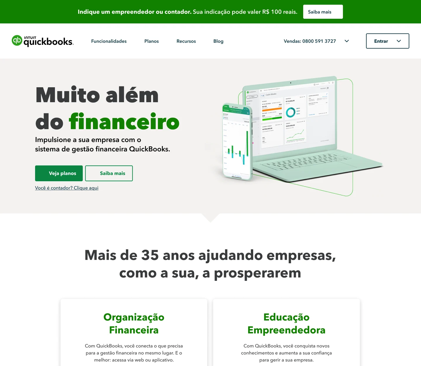
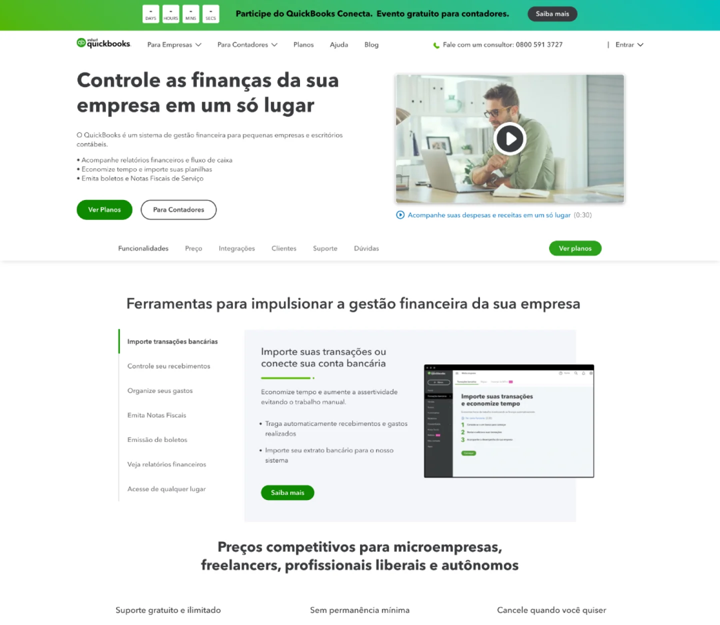
Home: lead with one promise and two clear paths
- Before
- A long hero with a video, a bullet list and feature tabs. Business owners and accountants shared the same path.
- Change
- One headline, “Veja planos” as the primary action, a separate link for accountants, customer stories and the Reclame Aqui rating closer to the decision.
- Result
- +21% forms sent and sign-ups
SMB page: move the price cards to the first row
- Before
- Plans sat below a long block of content. People had to scroll through features to find out what it cost.
- Change
- Simplified price cards moved to the top, with the buy-now (BIN) offer as the focus, plus new practical content further down.
- Result
- +71% sign-ups (trial + BIN)
ACC page: give accountants their own reasons to convert
- Before
- Accountants got a version of the business-owner story.
- Change
- Exclusive content for accounting firms, success-case videos, simpler forms and more conversion points along the page.
- Result
- +237% forms sent
Results from the first A/B round, each page measured against its previous version.

From three pages to the whole site
Once the first round held, the work became a routine. Each week, the internal teams and the agency reviewed campaign performance and conversion, and we chose the next change. In a year, about 95% of the Brazilian site was migrated, and the program ran more than 100 A/B tests.


Conversion is a habit, not a launch
The pages that worked best came out of short loops: research, an explicit hypothesis, a test, and reading the result with CRO.
The results also opened new work: a first-time-user flow in CRM and educational programs for new customers. That is the part I’d bring to any CRO and retention team. The habit of testing matters more than any single page.