Colégio Notarial do Brasil

APP - CNB

Teams & Softwares
-
Client | Development team
UI | Prototypes - Adobe XD | Photoshop
About the project
What is Colegio Notarial do Brasil app?
Colegio Notarial do Brasil app was a User Interface (UI) project created for a legal department of government entity.
I developed this app with my partner KL Soft Mobile Systems. The app was created with a native language for both iOS and Android platforms.
For this project, I was in charge of doing all the benchmark research to find competitors and similarities with other apps, as a way to cover their ideas and needs.
I worked side by side with the customer and the developers to bring this project to life, until it was published on the app stores for both platforms. We ran a small POC phase with a few users to check the usability and capacity of the application before launching it widely.
Conversion
- Increase the Conversion Rate for Sign-ups (Trials and BIN’s) and Lead Generation
- Increase Completion Rate for Sign-up started
Brand
- Increase the brand value for users
- Explore our benefits to differentiate us from the competitors
User Experience
- Better E2E experience
- Increase page engagement (time spent, elements clicked, etc.)
- Tell a story that deliveries our main benefits to customers
About the process
During the process, we did an extensive research with the competitors in the market to find similarities with our system and our users behaviors.
About the proccess
We also have the support from the customer support team to tell us about the complaints that the users have regarding our web application system.
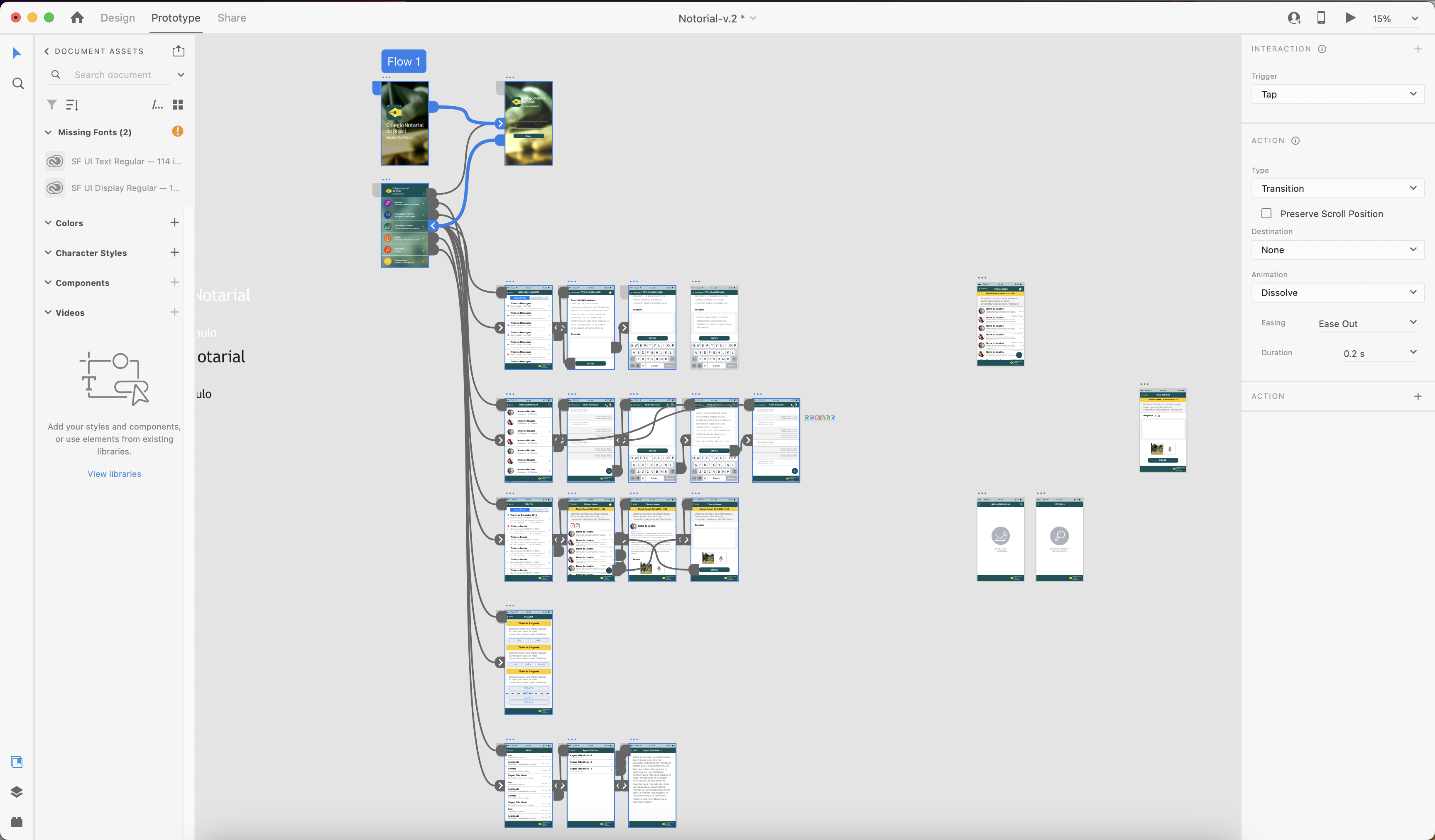
After the research and benchmark session, we start designing the Roku application, doing the wireframe, creating components and prototyping to validate the flow.
Our best friend and ally on this project was Roku’s documentation guide that provide us an extensive and clear instructions about the navigation behaviors and flow.
Some designs
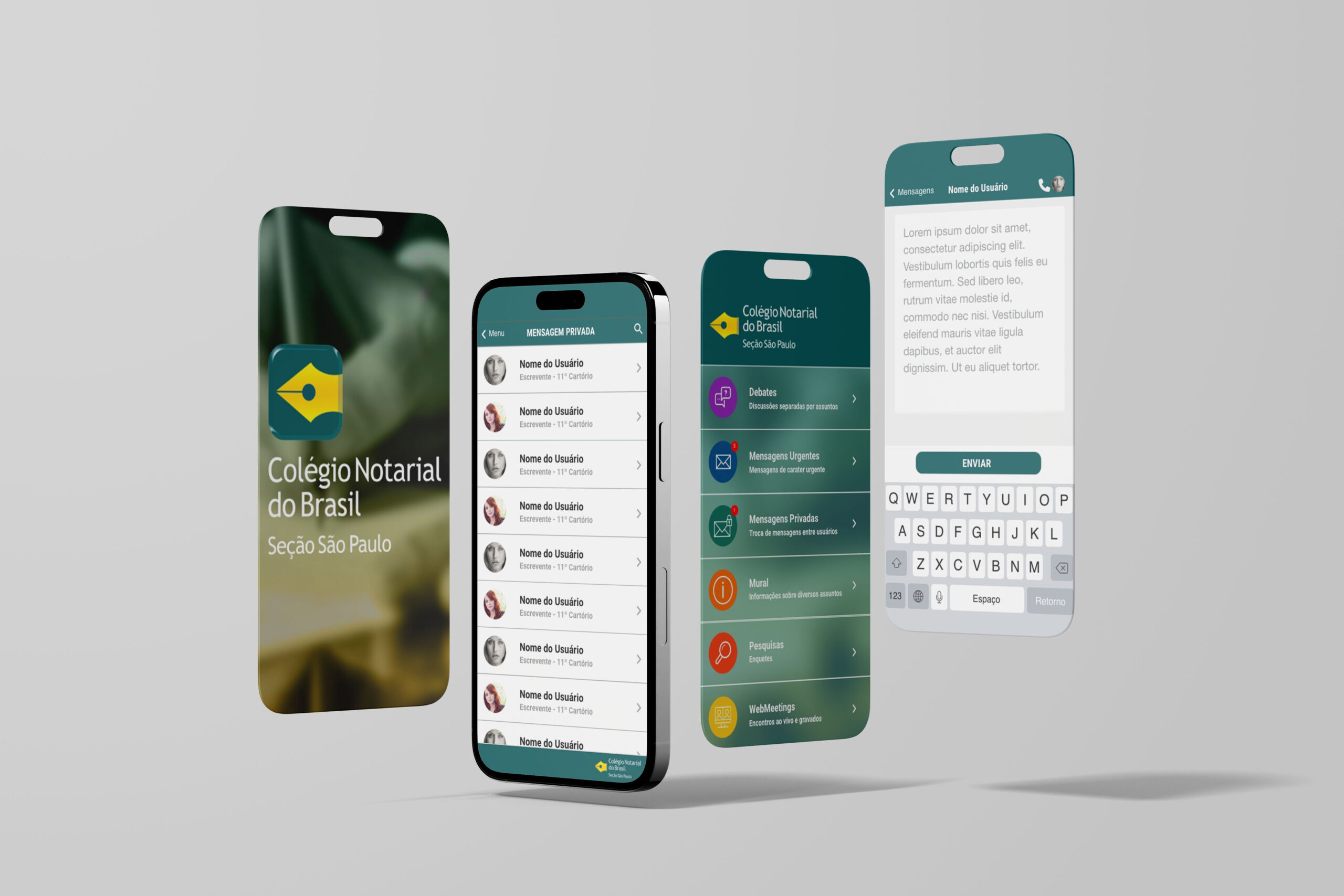
A few design screens and a movie from the prototype.
The concepts and wireframes were created by the development team.


Some results
This project was a live project because we are always doing changes to improve performance, story telling and adjust the journey of our customers.
All the results I showed were made by me and the awesome persons who I had the honor to work with, thanks for read and spent some time to know a part of my work.